In this restaurant, the challenge was working in an old hutong house which, although it had just been rebuilt with exterior features seemingly consistent with Beijing tradition, inside, the use of materials poorly aligned with old construction techniques made the space utterly anonymous and difficult to use.
So, without the possibility of working with the original atmospheres of the only seemingly traditional building, we tried to reinterpret the space differently, using materials from the local hutong tradition but in a more abstract way.
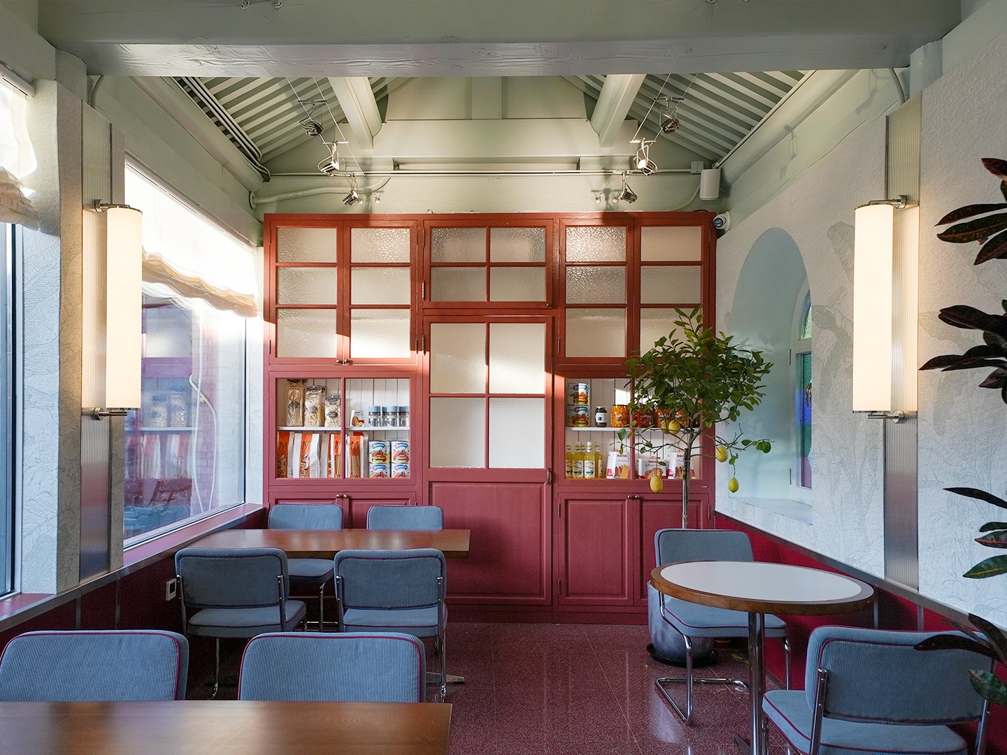
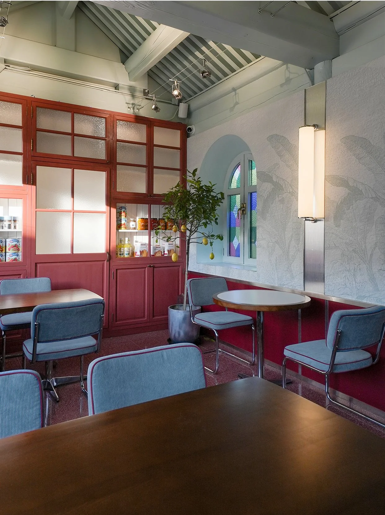
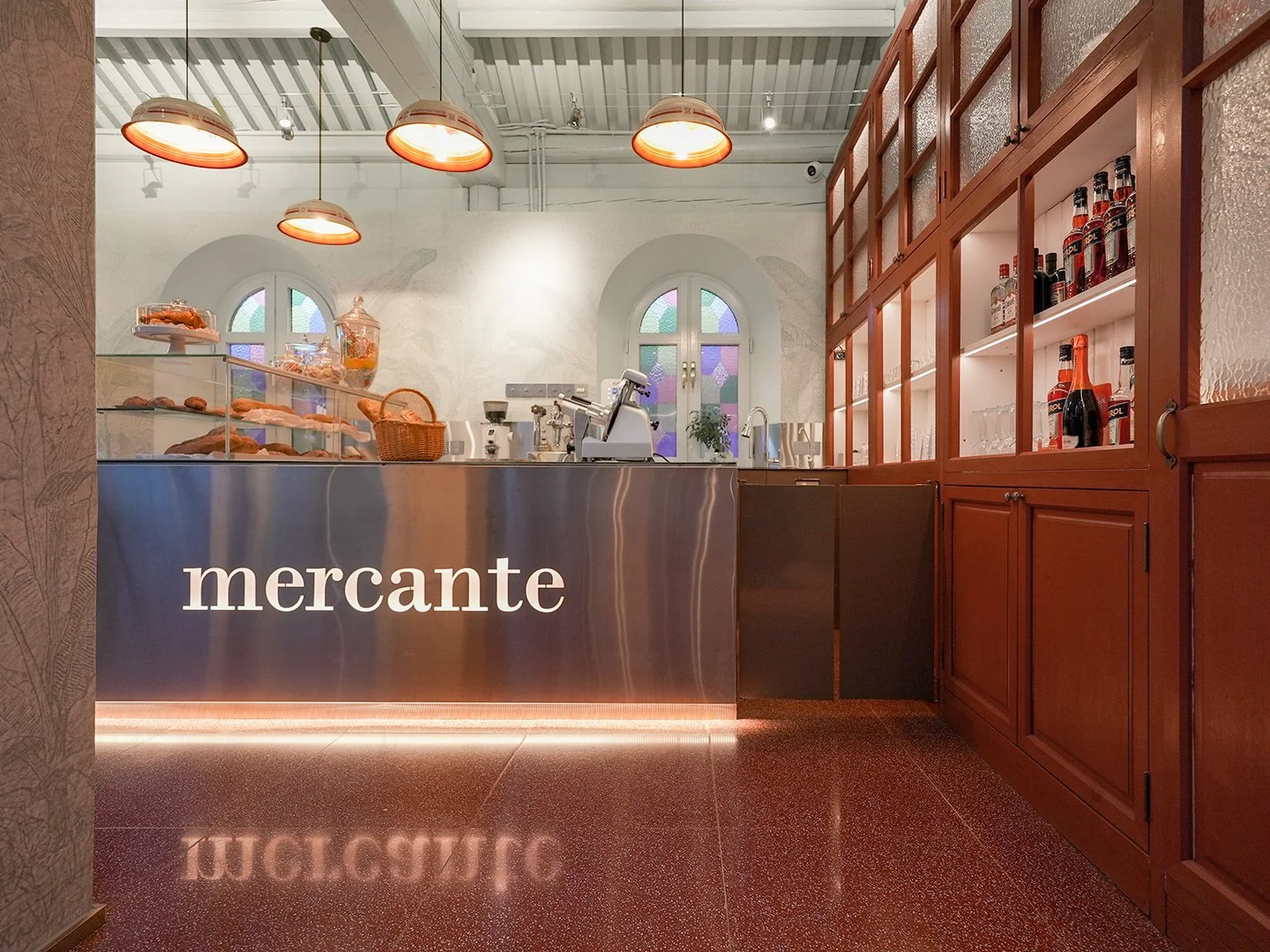
First, we opened large windows onto the internal courtyard to enjoy more light and thus participate in the picturesque environment of the dazayuan (compound courtyard).
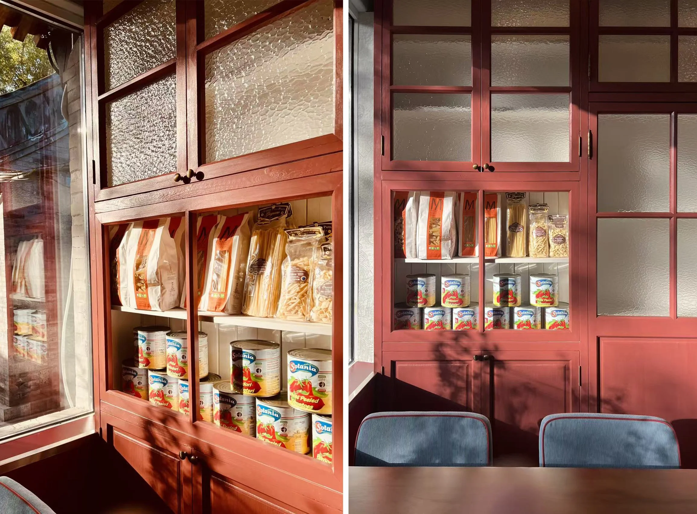
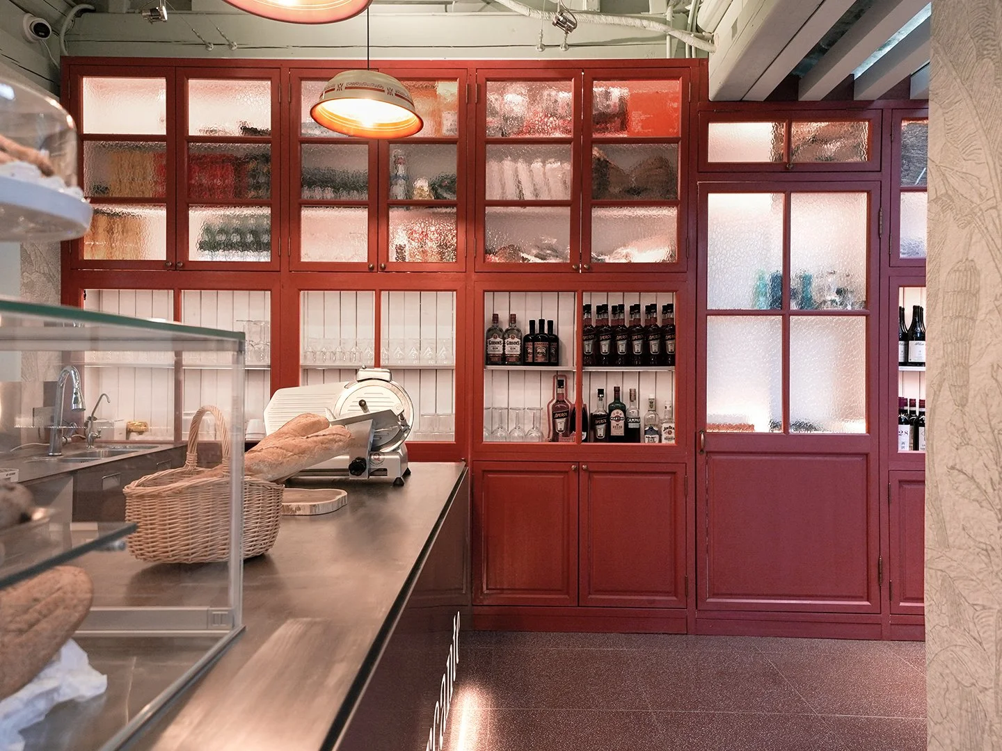
We also chose to use in this project, as in Mercante at Gulou, the wooden structures of hutongs building facades with their rhythm to create continuous frameworks that serve as focal points for the space in all directions. The frameworks recall not only Beijing tradition but also old Italian “gastronomie”, simultaneously providing spaces for displaying products and storage.
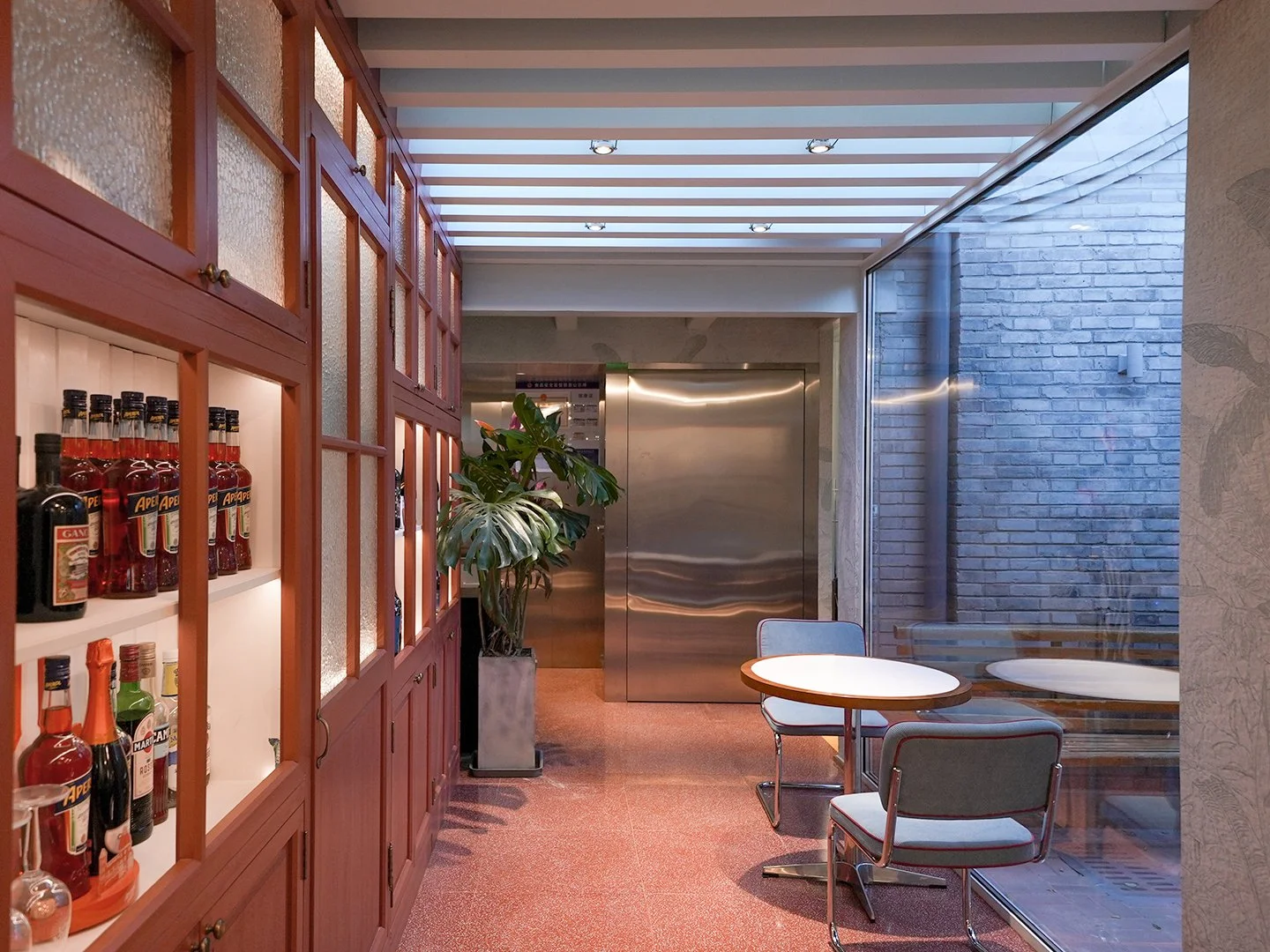
In this project too, we opted for the floor to be typical terrazzo tiles, common in the local tradition up until the 1960s.
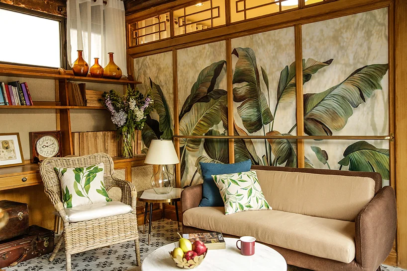
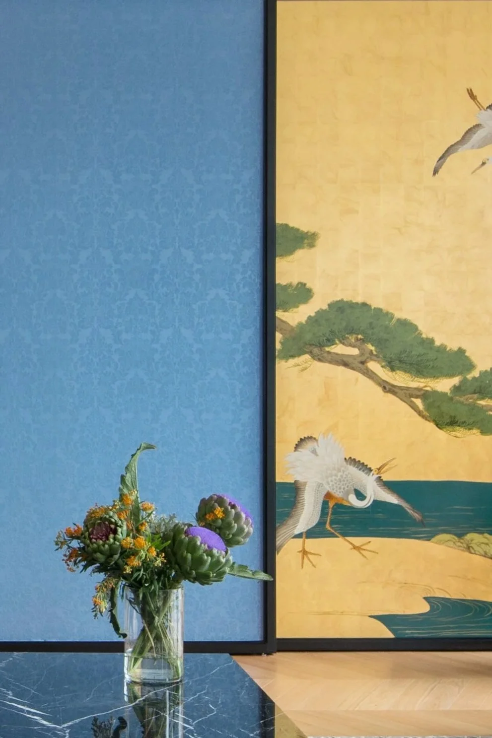
The color palette we chose plays on the contrast between “Forbidden City red” and aquamarine blue, which was typically used in the interiors of 1960s houses or in schools and public buildings from the same era.
The structure of the exposed roof trusses was originally made of new wood with an orange hue that was difficult to integrate into the design. For this reason, we decided to paint it the same tone as the walls, aiming nonetheless to enhance its structural elements without covering them up.
We covered the walls with a structured plaster-effect wallpaper featuring a faintly suggested tropical landscape pattern in a tone-on-tone design, using the same color as the roof.
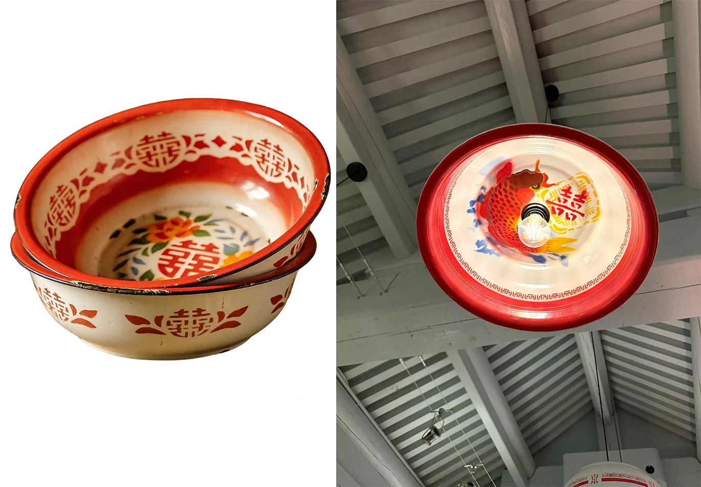
The table-height wainscoting, specially made from plastic laminate, and the steel details contribute to creating an interior inspired by the atmospheres of the 1950s and 60s. Here too, we used the beautiful painted tin bowls that were once used in Beijing homes for washing one's face and hands to make the lamps hanging above the steel counter. Their minimalist shape creates a contrast between contemporary and traditional, which is the key to interpreting this entire project
在这家餐厅,挑战在于在一个老胡同房子里工作。这个房子虽然刚刚重建,外部特征看似符合北京传统,但内部使用的材料与旧建筑技术很不协调,使得空间完全缺乏特色,难以利用。
因此,无法在这个仅表面传统的建筑原有氛围上做文章,我们尝试以不同的方式重新诠释空间,使用本地胡同传统的材料,但以更抽象的手法。
首先,我们在内院开了大窗户,以获得更多光线,并以此方式融入大杂院如画般的环境。
在这个项目中,如同在鼓楼的第二家 Mercante 一样,我们也选择使用庭院建筑内部立面的木结构及其节奏,打造连续的框架结构,使其成为空间各个方向的视角焦点。这些框架既让人联想到北京传统,也让人联想到古老的意大利食品店,同时提供了产品展示空间和储物功能。
在此项目中,我们也选择采用水磨石地砖这一经典材质——这种地砖直到二十世纪六十年代都是当地建筑传统中常见的铺地材料。我们的色彩搭配以"故宫红"与海蓝色形成鲜明对比,这种配色方案常见于二十世纪六十年代的住宅室内设计,同时期学校与公共建筑中也广泛运用此类色彩组合。
原本裸露的屋架结构是由新木材制成,颜色偏橙,难以融入设计。因此,我们决定将其粉刷成与墙壁相同的色调,旨在不掩盖其结构元素的同时,依然突出它们。
我们使用了一种带有若隐若现的热带风景图案(同色调)的结构性灰泥效果墙纸来覆盖墙壁,颜色与屋顶相同。
特意使用塑料层压板制成的齐桌高护墙板,以及钢制细节,共同营造了一个受 50 和 60 年代氛围启发的内部空间。同样,我们使用了曾经在北京家庭中用于洗脸洗手的漂亮搪瓷盆来制作灯具,它们悬挂在简约造型的钢制吧台上方。这种简约造型产生了当代与传统之间的对比,这是解读整个项目的关键。